
The English Summer Palette: How to Bring Its Quiet Beauty Into Your Home
There is a particular quality to the English summer that I find endlessly inspiring, yet often underrated. It isn’t the dazzling, saturated brightness of a Mediterranean July. It’s actually something quieter and more nuanced: the gentle haze of a warm afternoon, the softness of a garden in full bloom and the way the light seems to slow everything down. It’s a season that rewards those who pay attention to it. In this post, I want to share my thoughts on the summer colour palette and how to introduce it into your own living spaces.
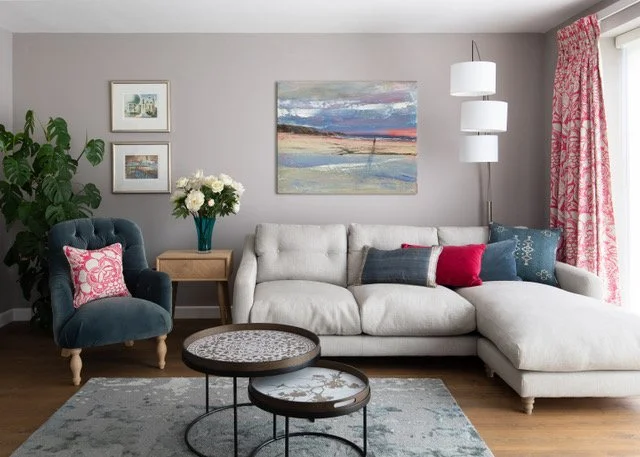
Forget the flamingos
When most people hear ‘summer colours’, their minds leap to holiday brochure territory, like neon cocktails and sunburn-bright hues. But that’s not what English summer is really about. Spring has done all the hard work – the pushing, the striving, the burst of new energy – and by the time summer arrives, the garden has settled into itself. Hayfields swishing in the breeze, a heavy-headed rose in full bloom, that warm afternoon sun that practically insists you sit down. Summer isn’t loud; it’s graceful and serene. That understated, quietly elegant quality is exactly what the summer interior palette is all about.
A palette that breathes
The colours of the English summer are softer than you might expect. Gone are spring’s sharp daffodil yellows and bright bluebells, replaced by wisteria, peonies and hydrangeas – all those powdery, slightly faded tones. The greens deepen and quieten. Everything takes on a chalky, cool quality.
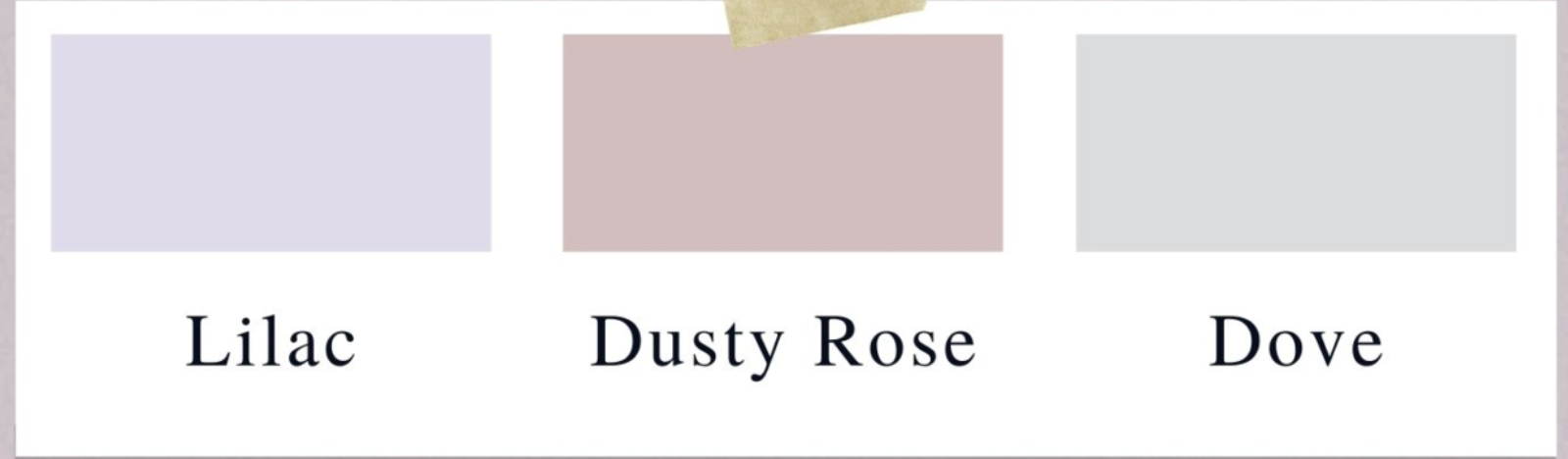
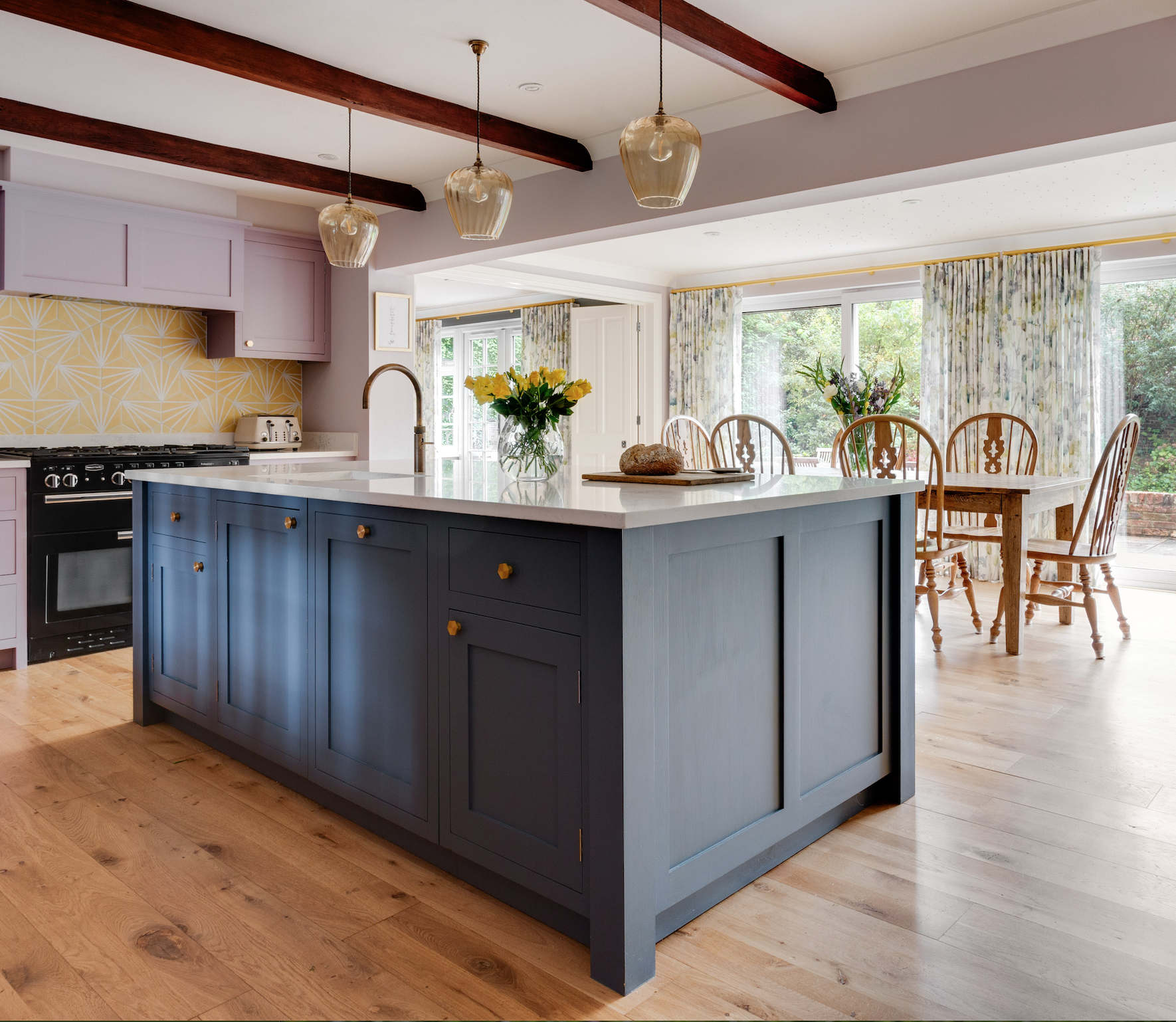
In practice: dusky pinks, soft lilacs, hazy blues and muted greens – never heavy, always with that sense of faded contrast. Like a beloved piece of fabric that’s been washed a hundred times and is all the more beautiful for it. This kitchen I worked on in Langton Green is a good example. Those soft yellows and chalky lavenders share the same cool, muted quality. Nothing is competing for attention, making the result genuinely calm and welcoming. The kitchen curtains are in Mariola by Romo – a beautifully soft floral print that bridges the yellow and lavender tones of the scheme perfectly.
More than colour
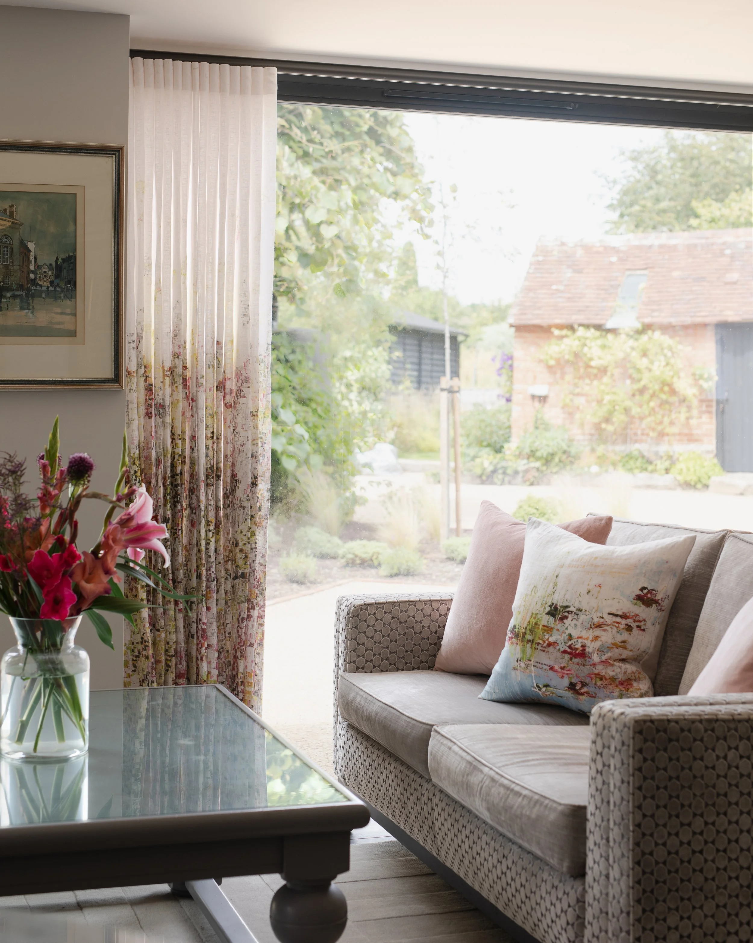
What I love about the summer palette is that colour becomes a background note. The focus shifts to texture, tactility and beautiful details – smooth linens, velvet cushions, refined shapes. A well-considered room rather than a busy one, where symmetry creates calm and beautiful things are given space to breathe. These unlined abstract floral linen curtains in a cottage conversion project let the light filter through in the most gorgeous way, with the summer garden literally reflected in the fabric. It’s that blurring of inside and outside that the summer palette does so well.
The walls here are in Dove Tale by Farrow & Ball – one of my all-time favourite neutrals for a summer scheme. It has just enough cool grey in it to feel genuinely restful, without ever reading as cold. The blind and cushion are in a Sanderson fabric, which brings in that touch of warmth and pattern without disrupting the calm of the overall palette.
The summer personality
A colour psychology theory developed by psychologist Angela Wright aligns personality types with seasonal colour palettes. The summer personality is romantic, elegant and quietly thoughtful. Someone who notices the details, who takes pleasure in a beautifully laid table or a considered arrangement of flowers. They want their home to feel like a refined, restful place.
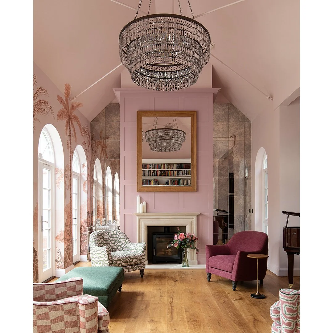
This west-facing reception room from a project in Hawkhurst is another perfect example of the summer personality. The dusty rose arches in Hellebore by Little Greene glow in afternoon and evening light – designed deliberately as a sundowner space. Pink is often dismissed as frivolous, but in this muted, considered form, I think it’s anything but. The chairs are upholstered in fabrics by Colefax & Fowler and Rapture & Wright, which are both wonderful sources for the kind of refined, characterful prints that suit this palette so well.
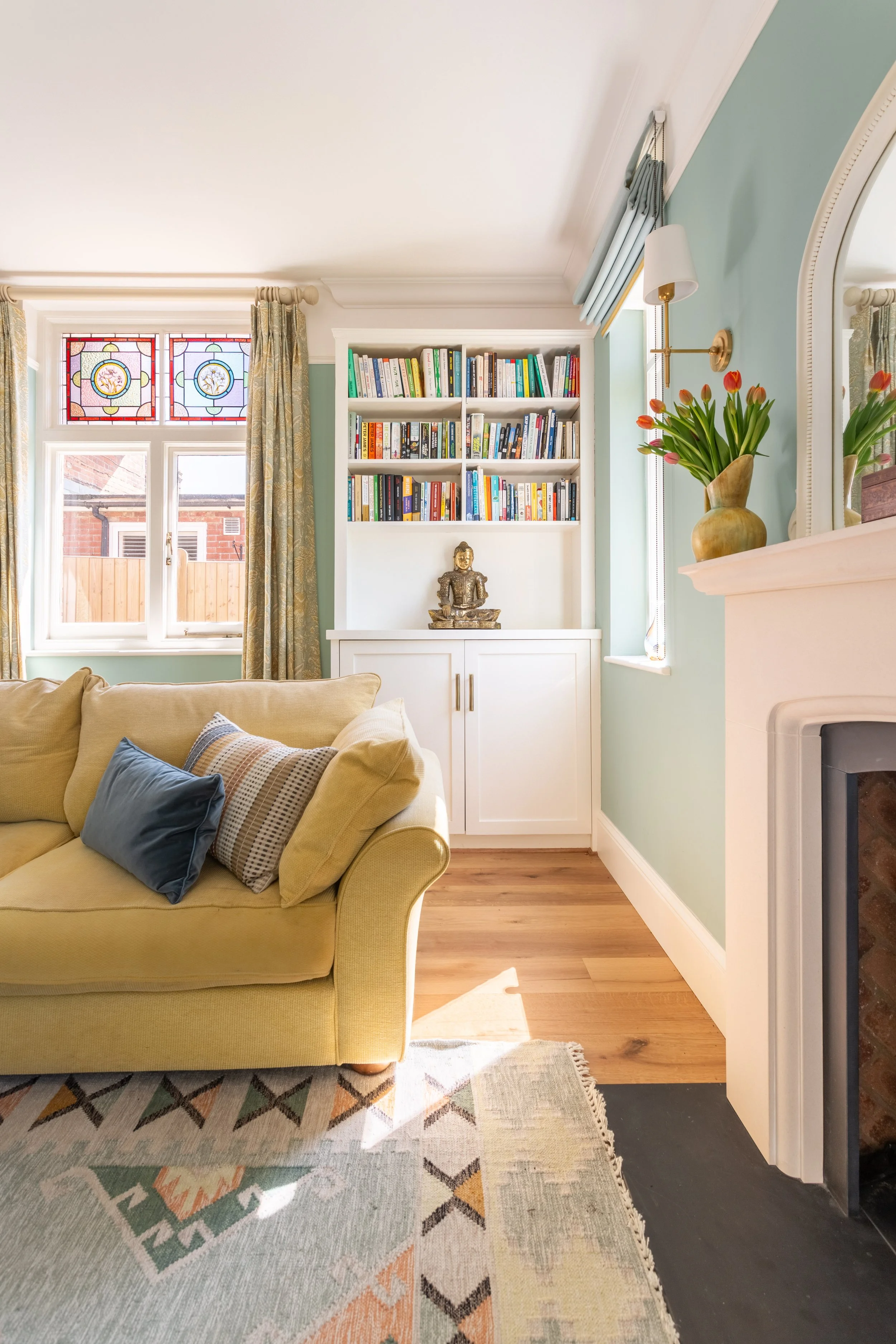
And here, this hazy duck-egg blue sitting room from a stunning Victorian coach house renovation shows how a cool tone can anchor a whole scheme. It’s fresh and calm, but warm enough from the natural wood and golden accessories to feel inviting rather than cold.
Find your summer palette
Colour psychology isn’t about prescribing a look – it’s about understanding how colour makes you feel, and using that to create a home that supports your wellbeing. If you find yourself drawn to the quiet beauty of a summer evening over the noise of a midsummer festival, it’s worth exploring what that says about how you want to feel at home.
Need some help finding a colour palette for your home that truly reflects you? Get in touch with me to chat about your next interior design project.
Nicky