
The phone call came two days after my client got the keys. She’d just moved into a substantial Edwardian house in Hastings, boxes were everywhere and she needed help. Here I want to take you through the initial process: getting to know the house, understanding the brief and building the vision for each room. It’s the part of a project that happens before anything is ordered, painted or installed, but in many ways it’s the most important. Get this right, and everything else follows.
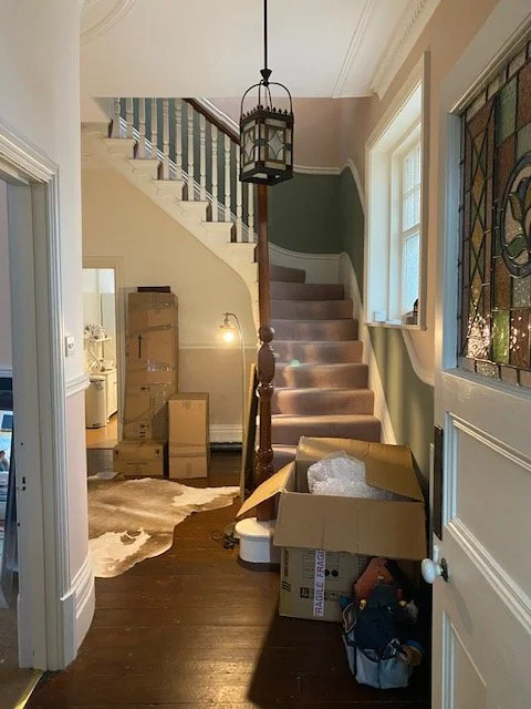
[The hallway on first visit, boxes visible, staircase with existing green paint]
The house
This project started with a characterful Edwardian house with good bones, beautiful period details and a personality all of its own. Importantly, no major structural work was needed, apart from some minor roofing and guttering repairs, which meant we could focus entirely on the interior. My client had brought relatively little furniture from her London home and a few quirky pieces had been left behind by the previous owners. A blank canvas, more or less, but one with some interesting starting points.
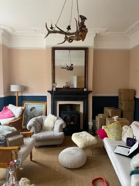
(The front sitting room on first visit, with existing antler light and pink and navy walls)
Getting to know the client
Before I touch a paint chart or open a fabric sample, I need to understand who I’m designing for. My client has a strong, joyful aesthetic; very feminine, pattern-led, full of colour and life. Flowers, birds and butterfly motifs featured heavily on her wish list. She loves art and wanted her home to feel full of personality, warmth and a little drama. The full-on femininity of her preferences was not my usual comfort zone, but I was happy to run with it.
The colour palette she responded to was warm and rich: pinks, yellows, mustards, oranges, sandy tones and warm whites, with a cooler note of blue earmarked for the kitchen and one of the bedrooms. If you’ve read my post on summer colours, you’ll recognise some of these instincts at work.
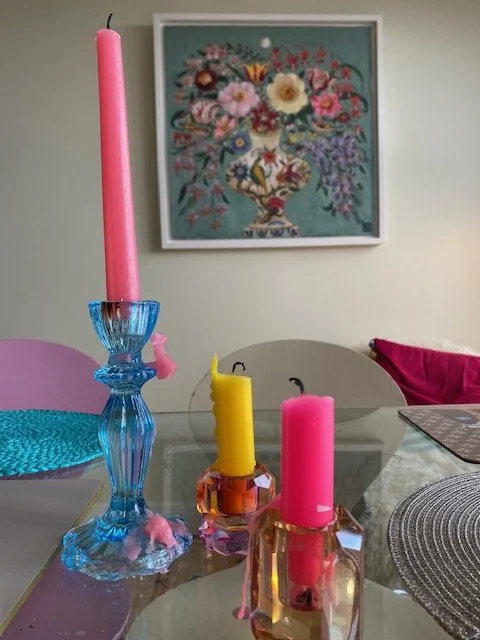
[Close-up of colourful candles and artwork, showing the existing aesthetic and love of colour]
Room by room: The brief
With a house of this size, the challenge is making sure it all connects, flows and feels like one home rather than a series of separate decisions. Here’s what we were working with and how I planned to approach each space:
The hall has two south-facing windows and should feel light and welcoming, but on my first visit it felt surprisingly gloomy. It needed brightening, better lighting and a proper moment of entrance drama. A statement stair runner was high on the list from the start.
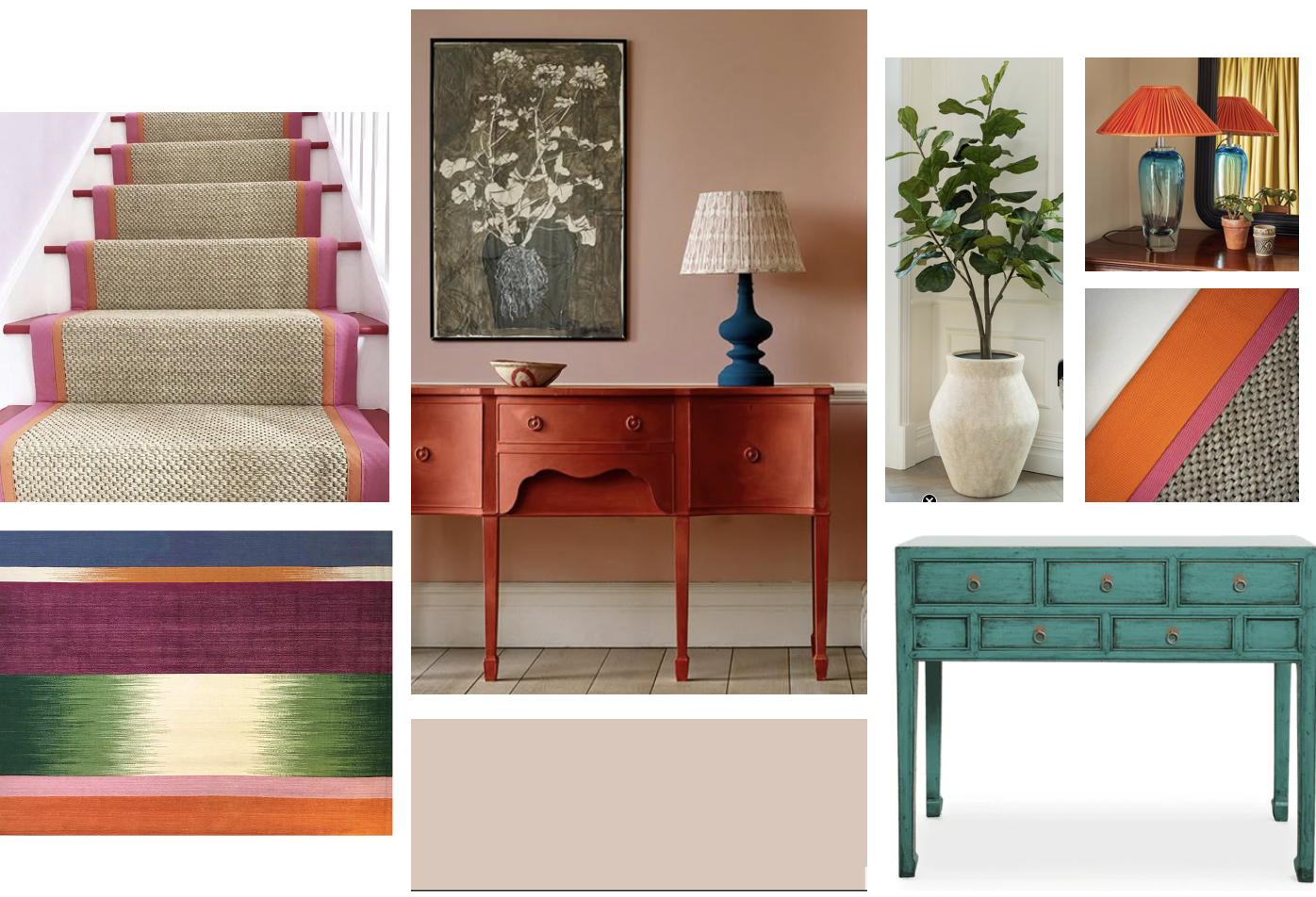
[Hallway mood board with stair runner, terracotta drawers, lamp and warm pink paint sample]
The front sitting room faces west and gets gorgeous warm evening light, perfect for its role as the main social space. The existing antler pendant light had to go. The pink and navy two-tone walls were interesting but needed rethinking and the curtains weren’t working at all. The brief: seat six people comfortably, feel welcoming and atmospheric and do justice to that evening light. I was drawn to richer, more enveloping tones here and something that would feel alive by candlelight.
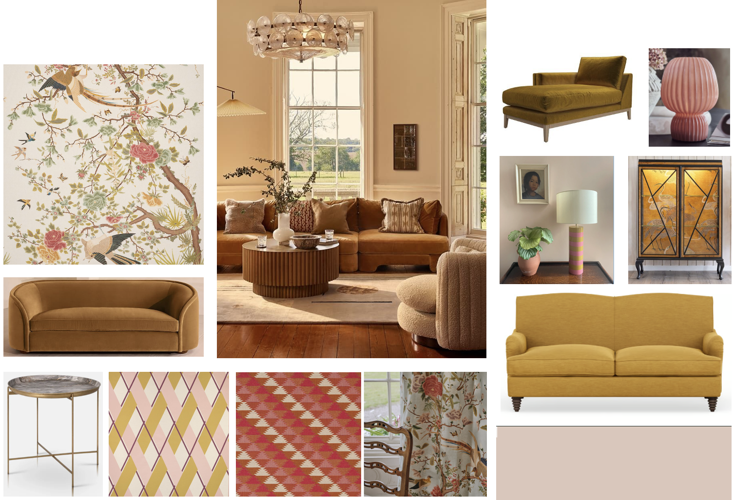
[Sitting room mood board with warm caramel tones, chinoiserie wallpaper and statement sofa]
The rear sitting room is cooler and east-facing, with wall-to-wall bookcases flanking the chimney breast and French windows opening onto a small terrace with a view of the sea beyond. My first instinct was to make this a study, but the more I looked at it (and that view) the more I felt it deserved to be a second sitting room. A summer indoor-outdoor space. Somewhere quieter and more contemplative than the front room.
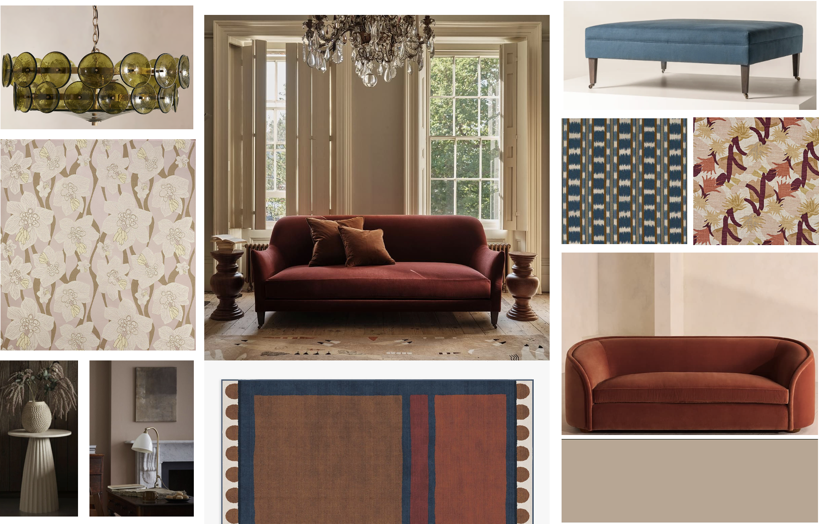
[Mood board for the soon-to-be second sitting room, with deep rust and navy tones, dramatic rug and rich velvet sofas]
The kitchen isn’t being remodelled, but it needed more storage, a better layout, a change of colour, new lighting and a general sense of cohesion. We planned to have an additional cabinet made to blend with the existing units, relocate the fridge to open up the dining area and reconnect the whole space to the garden. The view from this room is utterly spectacular.
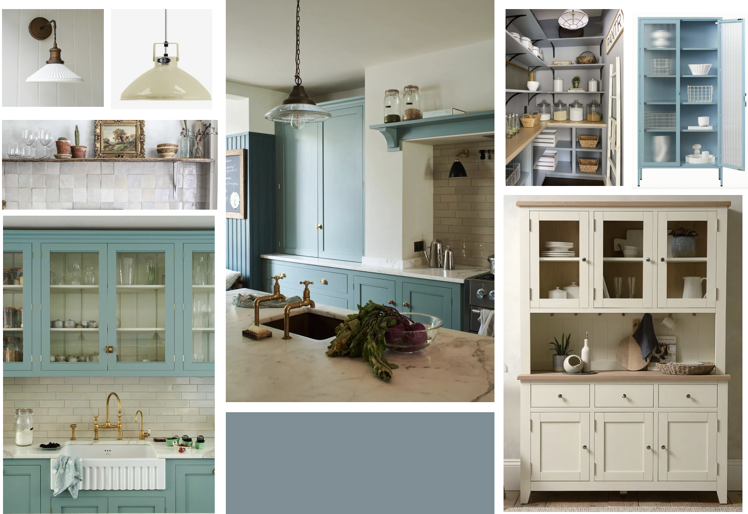
[Kitchen mood board with duck-egg blue cabinetry, butler’s sink and brass taps]
The bedrooms needed to be colourful and comfortable without a huge budget. The main bedroom had an existing red velvet bed – a brilliant piece that immediately suggested a direction.
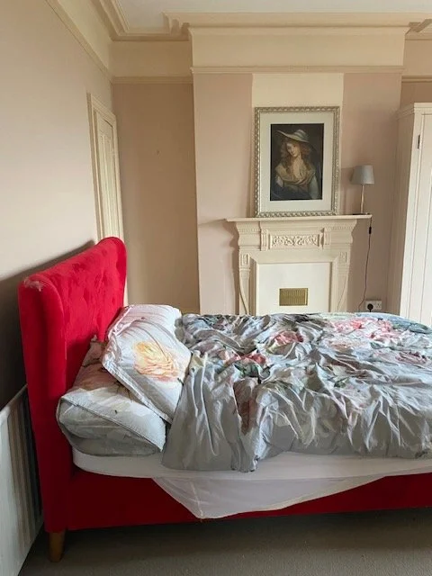
[The main bedroom on first visit, with existing red velvet bed and pale pink walls]
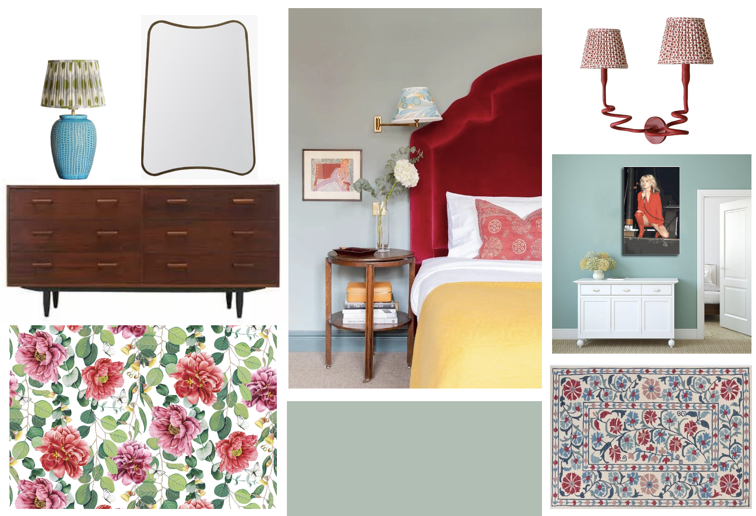
[Bedroom mood board with sage green walls, crimson headboard and botanical wallpaper]
The cloakroom and utility room were functional but felt a bit joyless, both crying out for some colour, pattern and personality.
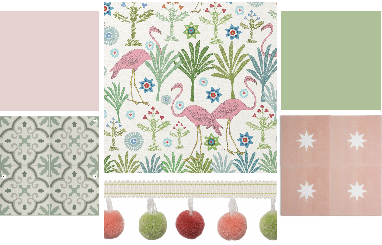
[Cloakroom mood board with flamingo fabric, pink and green tiles and pompom trim]
The two attic bedrooms, one of which had a lovely iron bed and sloping ceilings, needed a touch of glamour for guests. Wallpaper felt like the obvious answer here. I had a very clear idea for these spaces almost immediately, and it’s probably the scheme I’m most excited to reveal in Part 2.
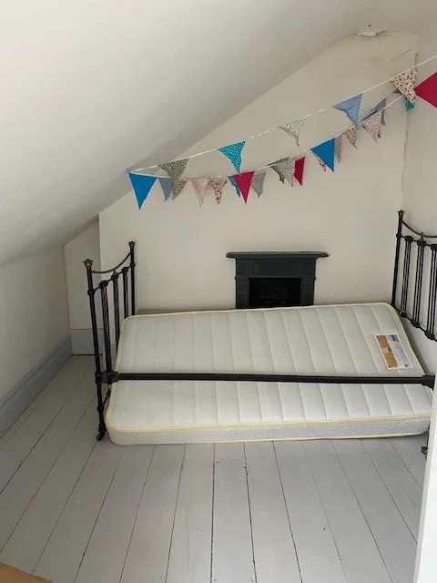
[One of the attic bedrooms on first visit, with iron bed and bunting]
Look out for the big reveal
I won’t give too much away at this stage – that’s what Part 2 is for. But looking at these mood boards now and knowing what we went on to create, I’m quite proud of how this project has come together. Stay tuned for the big reveal!
Are you looking to transform your home but not sure where to start? Whether you’ve just got the keys or you’ve been putting it off for years, I’d be happy to help. Get in touch to chat about your next interior design project.
Nicky