
A Contemporary Refit for a Classic Design
The Project
The interior design of a house designed by one of the leading architects of the 19th Century, Decimus Burton. Decimus was born in 1800 and his work spans the Georgian, Regency and Victorian periods.
The clients already had architects, contractors and planning permission to remodel and update the property. What they were looking for was an interior designer who could create a new language for the house, with a design direction which would respect the wonderful Georgian architecture whilst also making a comfortable home suitable for contemporary family life.
The overall design direction was to brighten and uplift the tired décor, particularly on the ground floor, which is where we’ll be focussing our attention in this blog. The clients were particularly fond of the colour blue, so this provided a base point for me when I started creating the mood boards.
The Hall
This was a grand space with panelling and a large, ornate fireplace. But it was dark, with an overbearing colour palette and insufficient lighting. It also had a rather dramatic tartan carpet - great fun but completely incompatible with the remodel, so it had to go. The clients were originally considering timber herringbone flooring but agreed that it would be impractical and a poor match for the wooden flooring in the reception rooms off the hall. I suggested porcelain tiles in a limestone style from Mandarin Stone. This would be both good value and practical, introducing the warmth of a ‘country house’ feel and leading nicely into the kitchen.
I suggested Farrow and Ball Green Smoke to brighten up the outer lobby. This would lead into the panelled area, which already had a suitable palette, but needed better lighting. Three matching ceiling lights would be the solution here. Other possibilities were a console table with side lamps and a mirror for the lobby opposite the window to bounce the light around. The clients also wanted a carriage lantern outside the lobby. They had seen one they liked at a local school, so we used this for reference.
For the inner hall, I was looking at a combination of warm grey and soft green; Farrow & Ball Pidgeon, Old White and Shaded White. But, keeping in mind the client’s love of blue, to accent these neutral colours with blue rugs and pictures. The mood board seen below shows how I incorporated all of these ideas into my design suggestions.
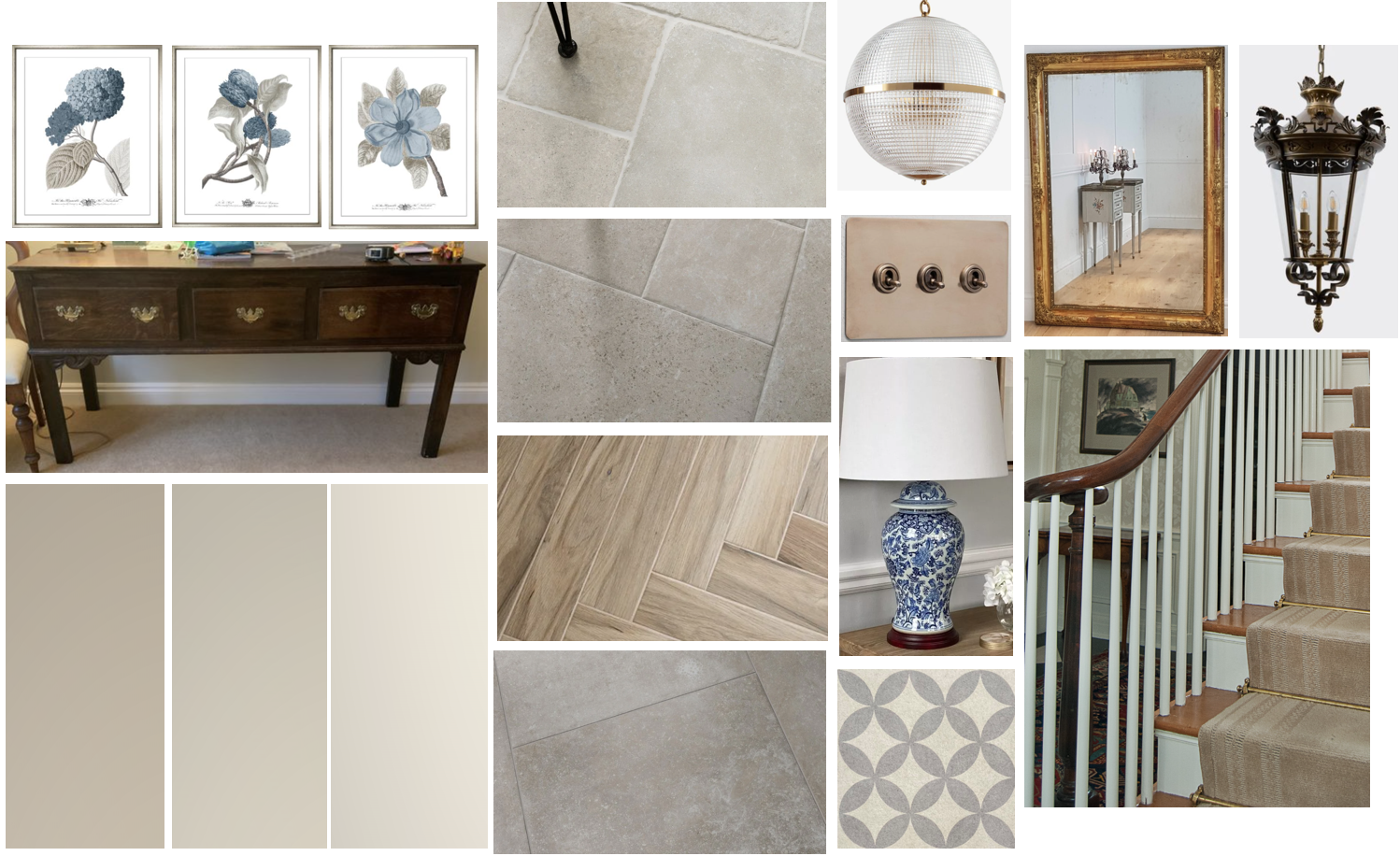
Some of the other remodelling that I needed to consider for this area included replacing the radiators with heritage-style cast iron ones; coat and boot storage; the laying of a hearth and brass fenders around the fireplace; inner lighting for the coat cupboard; new stairs to the cellar; blinds to the windows going up the stairs to the first floor and a new stair runner.
Downstairs cloakroom
We wanted the flow of the colour palette in the hall to include the cloakroom, so kept to a similar colour scheme here, but introducing a more teal blue. The client had originally wanted statement wallpaper here, we eventually settled on Little Greene Stag Trail, which has a ‘historic’ style suitable for the period of the house.
We complemented this with the teal blue paint colour Tea With Florence, which we used on the panelling below the wallpaper to give it a modern uplift. The room itself needed a complete refit – storage, a mirror, new flooring and better lighting.
The mood board below shows what I had in mind.

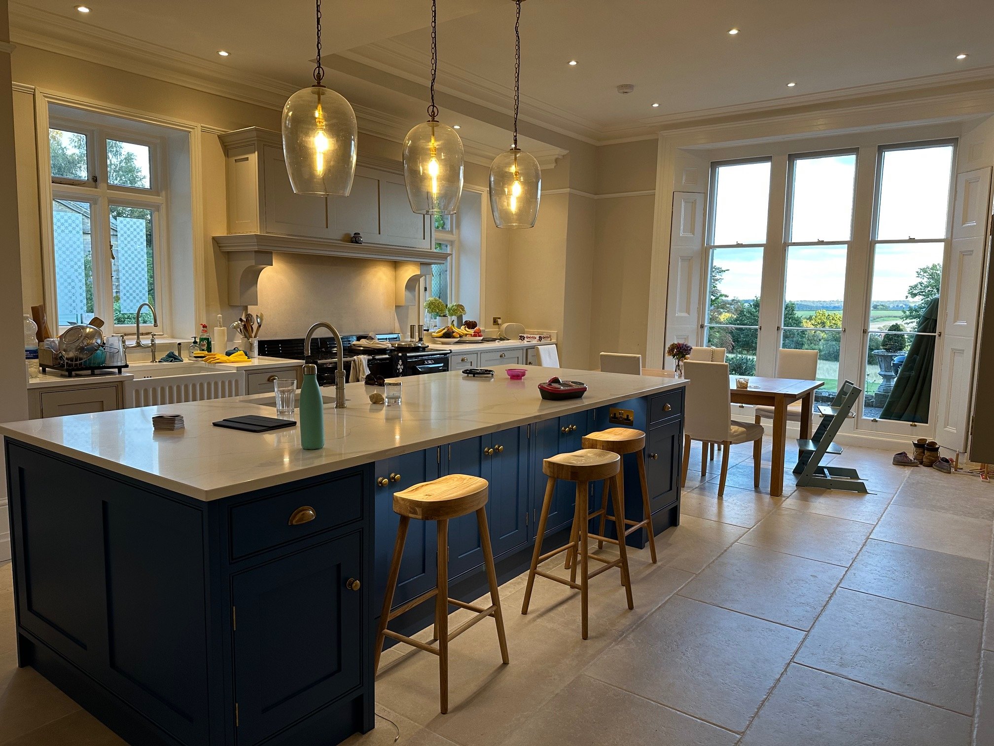
Kitchen

The kitchen was south-facing and bright, which is always a good starting point. The picture above shows how it looked before the work started. The original stairs to the cellar, seen on the left of the picture, were removed, opening up more room for cabinetry.
For the colour palette, we were looking at a crisp French blue; James by Little Greene and a warm grey called Rolling Fog, which would blend nicely with the floor. Below is the mood board I created to illustrate these ideas.

It turned out that the client’s kitchen supplier had let them down, so I recommended a local bespoke furniture company to take over. Traditional Bespoke Furniture (TBF) specialise in hand-built, in-frame ‘Shaker’ style cabinetry and are also great at taking an existing design and making it their own. Amazingly, they even had a gap in their schedule!
But the clients still needed some guidance with tiling, flooring, door furniture, feature lighting over the new island, window dressings, and new table and chairs. In the picture below, you can see how the finished kitchen contrasts with how it looked before we started work there.
Study
North-facing, this room was as cold and dark as the kitchen was light and bright. It also lacked identity, having previously been a games room, then a study, now – possibly – a formal dining-room. Insulating the flat roof and putting in underfloor heating would warm the room up. Bringing in colourful rugs and improving the lighting would also help with this.
But the room’s cold atmosphere was exacerbated by the heavy paint colour, a blue/grey so dark it was almost black, offset by the stark, white woodwork and ceiling. I wanted to soften all of this by introducing a warmer colour palette, which would also brighten up the grey sofas in the room. But the clients had a fixed idea of what they wanted here and eventually went with a much darker blue, quite similar to the original colour.
The mood board pictured below shows how the furnishings could be used to demonstrate the multi-functionality of the room.

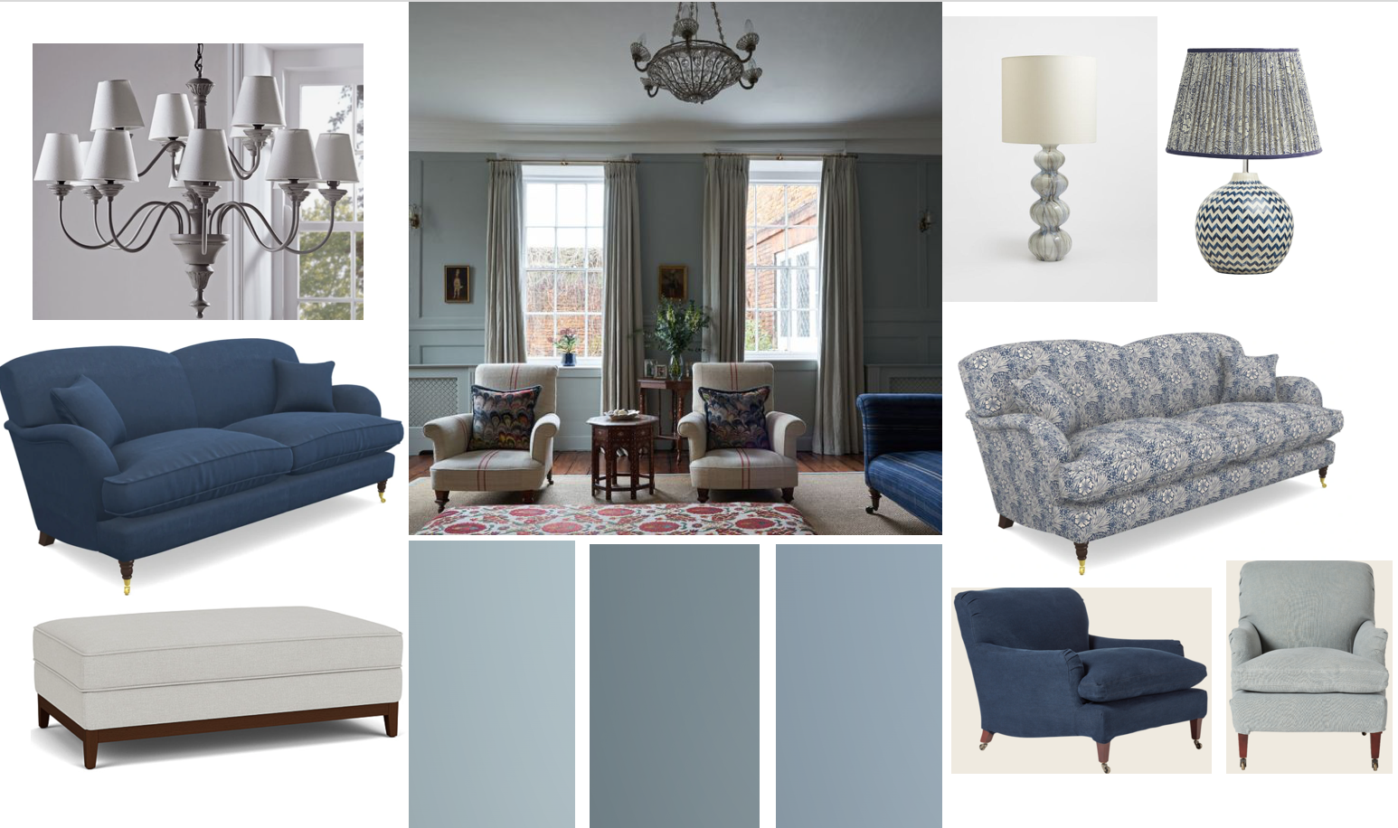
Family sitting-room
A friendly family room in constant use, the colour palette here had to be similar to the hall, as, due to the constant coming and going of the children, the door between the two spaces would almost always be open. But it needed additional furniture to further complement the rich blue velvet sofa. We considered soft, warm grey for the cabinet storage, with blue walls up to picture-rail height. Paler ceilings, here and in the rest of the house, would make for a naturally brighter atmosphere throughout.
Other considerations were new curtains and pelmet and new wooden flooring underneath the carpet to better link with the formal drawing room next door. We also needed improvements to the lighting and were looking at possibly introducing up-lighting along the cornice on the fitted bookcase for additional, warm, ambient light.
The mood board below illustrates how I planned to work with the overall blue tone of the room.
Formal drawing-room
A south-facing room painted grey, with grey curtains, this room was to remain largely unchanged, although we considered changing the pelmets for something lighter and more sympathetic. And although the wooden floor would stay, underfloor heating needed to be installed. The room featured a collection of antique furniture and works of art which could be further complemented by using rugs and scatter cushions to introduce layers of pattern and texture in muted pinks.
The mood board seen below demonstrates how the subtle introduction of pink would slightly soften the room's formality.

Conclusion
When working in a house which has a particular, beautiful architectural style, it’s important to keep this in mind when working on the interiors. Whilst the refit needed to freshen up the atmosphere and make the house suitable for family life, it also needed to respect the building’s heritage. The clients were fully aware of this as we worked together to ensure our changes were always complementary and appropriate.
In my next blog, we’ll look at how we continued to carry this theme throughout the rooms on the first floor of the property.
I love providing interior design direction for family homes, considering colour, furnishings, flooring and lighting, along with family living, with an element of indulgence, a little bit of drama and plenty of personality.
If you would like a hand creating your dream home or want a second opinion, give me a call, 07773 372 158, or send me an email via nicky@nickypercival.co.uk
I look forward to hearing from you.
Nicky