
What Are The Colour Trends For 2023?
New year, new direction?
The New Year is a time for making plans. To look around your home and see where improvements could be made. Perhaps you are considering remodelling or redecorating. Or maybe a smaller project, like freshening up your soft furnishings. If so, you may be wondering what direction the annual colour trends will be taking. Which hues and shades will sit on the top designers’ palettes this year? Which colours should you be looking for on your paint swatches? And how likely are the colours which are ‘in’ this year to still be on trend over the next few years to come? Let’s find out…
Neutrals with depth
Understated neutrals have been in fashion for a few years now, and although elements of this trend will continue throughout this year, with mushroom grey and all shades of beige being this year’s neutrals of choice, there is also a move to return to more bold, ‘statement’ colours. Even the longstanding pariah of the colour world, brown, will be making something of a comeback.
This year’s neutrals will have more depth than those of the previous few years. Beige is back, but with more underlying texture than we have become used to, giving it a warm earthiness which will blend beautifully with deep reds, terracottas, or even a rich brown.

Photo Credit Farrow & Ball
Soft sophistication and ‘earthy’ tones
One of the top colours on many experts’ lists is pistachio green. Although softer tones will be less fashionable in general this year, soft greens will continue to be a popular choice to offset some of the bolder colours to be found elsewhere. Ruth Mottershead, a paint expert with the British paint company Little Greene has been quoted as saying that the “soft sophistication” of this colour is a large part of its appeal.
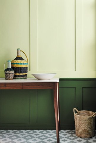
Photo Credit Farrow & Ball
2023 is going to be all about ‘earthy’ tones which help us feel connected to the natural world around us, with mushroom grey epitomising this trend. If the fast pace of life beyond your front door is a bit much, the calming, soul-soothing effect of this natural, gently earthy colour could be just the thing you’re looking for.
Ever-enduring popularity
Soft purples have been bubbling under for years, and 2023 is no exception, with lavender predicted by some to be the ‘colour of the year’. Its association with wealth and royalty is often seen as one of the reasons for the ever-enduring popularity of purple, with many of its softer shades (such as lilac, as well as lavender) having long been on most interior designers’ ‘top ten’.
The lavender blue known as Veri Peri was the Pantone Colour Institute’s ‘Colour of the Year’ for 2022, as seen in the header image of this blog. Its popularity is not expected to diminish.
So perhaps it’s no surprise that paint brand Mylands has seen a 33% increase in lilac-related searches on its website
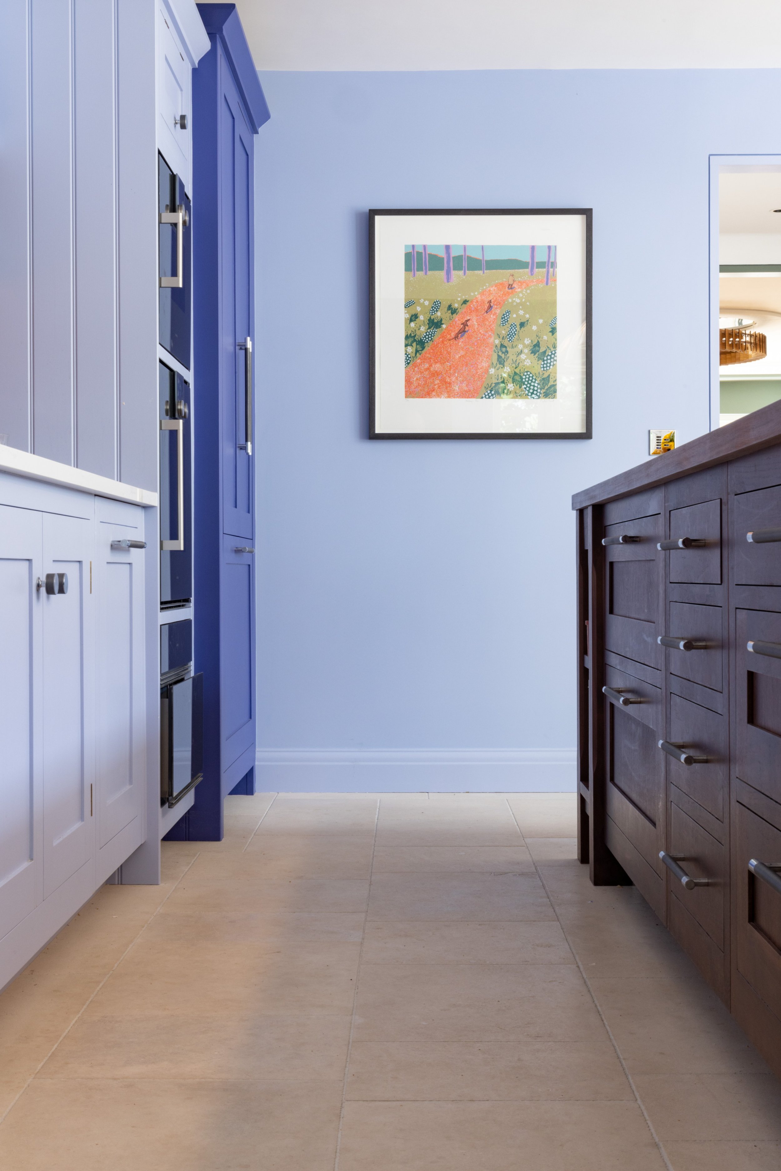
Photo credit: Photography: nicksmithphotography.com
Custom-made floor: Artorius Faber
This year will also see a resurgence of the plum shade. This is perhaps a little darker than we have become used to, but 2023 is definitely the year to be experimenting with some of darker colours which have previously been side-lined or dismissed.
Sumptuous and inviting…
Rust. That beautiful shade which sits halfway between red and brown, with just a hint of orange seasoning. Sumptuous and inviting, beckoning you into its warm embrace, dynamic enough to almost be described as bold, but soft enough to never be offensive. Rust could be the perfect choice for those wishing to be a little adventurous, a colour as warm and inviting as a log fire on a cold winter’s day. But if rust is a little to bold a choice for you, something slightly softer and more sophisticated, such as terracotta or paprika, could be just up your street.

Photo Credit Benjamin Moore
Brown is back
Brown has been out of fashion seemingly forever, but this year it’s back, and is possibly ‘the’ statement colour of the year. What was once seen as drab and boring has now found a new lease of life as the sophisticated, strong and dramatic colour which also serves to bring out the best in other, surrounding colours and textures.
Also in Living Etc Magazine Edward Bulmer, of Edward Bulmer Natural Paint describes his London Brown as “strong and warm, but somehow respectful to other colours, regardless of weight and shade”.

Photo Credit Edward Bulmer Paint
And with 2023 being the year in which our decorative choices will help reconnect us with the natural world around us, there is no colour which epitomises this move better than a rich brown, the colour of soil and the earth itself.
Oranges and yellows are also back this year, although perhaps in softer shades than might have been popular in years gone by. The yellow shade of citrus, particularly, could be a stand-out. However, if you want to go bold, but lack the confidence to go all-out, these colours can also work beautifully when offsetting something more neutral. But if you’re feeling really brave, try offsetting yellow with a rich black for one of the year’s most striking combinations.
Colour of the year?
Hot pink. Now here is a bold choice which may not be for everyone. But even though it might be a bit much for an entire wall, it could be an adventurous selection for your new soft furnishings. If your lampshades, cushions and bedspreads need an overhaul, this could be a colour worth looking at if you’re feeling playful and daring. You won’t be the only one.

Leatrice Eiseman, executive director at the Pantone Colour Institute (widely recognised as a leading global source of colour expertise) describes ‘Colour of the Year’ Viva Magenta as a “pulsating colour, whose exuberance promotes a joyous and optimistic celebration”, as quoted on www.livingetc.com

Photo Credit Pantone Colour Institute
Bright, summer-y tones
Although it’s still only mid-January, it already feels like it’s been a long winter. Perhaps that’s one of the reasons why bright, summer-y tones will also be seeing a resurgence this year.
Following on from the revelation that hot pink could be one of the year’s unexpected successes, it is thought that colours often previously dismissed as ‘childish’ could be making a comeback, albeit in slightly more muted tones than might be found in a child’s bedroom. So be prepared to see more soft pinks, tangerines and pale yellows than you may have become used to. You could be surprised at how well they can work when done right.
Looking for a chic tone to brighten up a contemporary bedroom or bathroom? This year’s smart money is on jade. The suggestion of coastal tranquillity can work particularly well for anyone living by, or favouring, the seaside.
Timeless primaries and the minimalist look
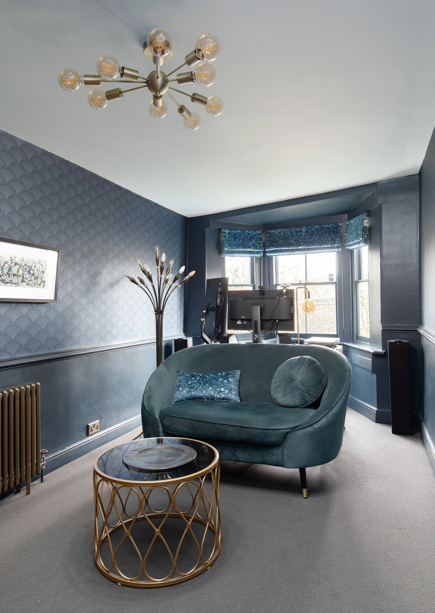
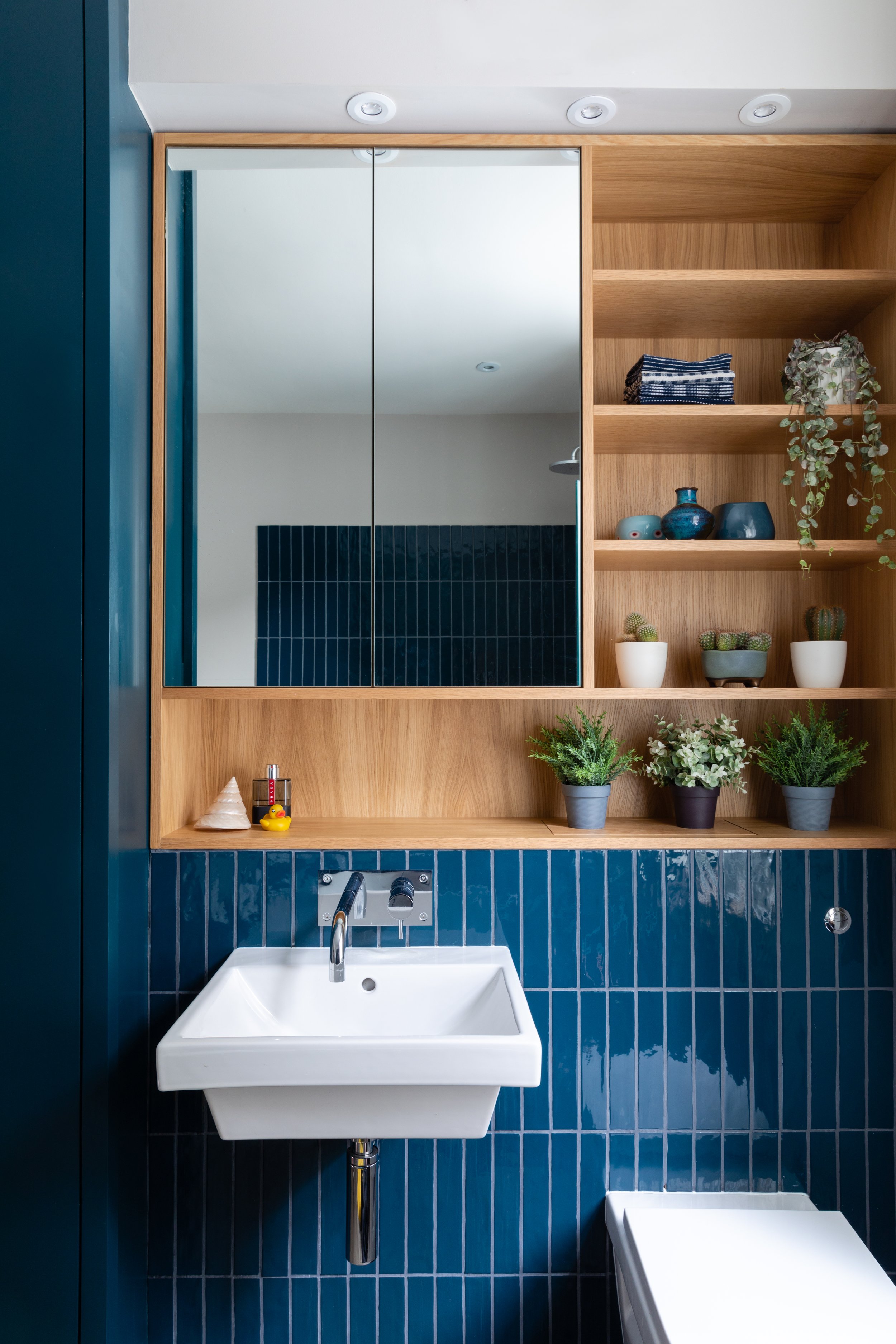
We’ve already discussed some darker shades, such as brown and rust. Also present on this year’s palette will be deep, rich blues. They may take a little getting used to, but the warmth, depth and sophistication of these glorious tones will undoubtedly grow on you.
And whilst we’re on a primary note, this could also be the year designers return to red. Perhaps the boldest colour of all, this timeless classic won’t be everyone’s first choice, but if you dare to be dangerous, the honest, vintage look of a perfect red can be the ultimate showstopper. Be careful though. Heed the advice of Joe Studholme, a colour curator with Farrow & Ball when he describes red as a “provocative” colour, which needs to be used with “thought” and “confidence”.
It's not all about colour this year though. The monochrome look is also likely to feature prominently, with a black-and-white theme being a popular choice amongst minimalists. And if ultra-minimalism is your thing, then perhaps the ‘blank canvas’ look of whites, off-whites and soft neutrals could be just what you are looking for.
In summary
So, this is 2023 – the year when striking bold colours will make a comeback, neutrals will have a little more depth, monochrome or blank canvas will be the minimalist option and rich, chocolatey browns will finally see something of a resurgence after many years in the wilderness.
I hope I have inspired your choices of colours, tones and shades for your interior design projects for the year ahead.
But will your decorative selections stand the test of time?
I believe they will, as colour trends tend to have more longevity than those of the fashion world, for instance. So, follow your heart, be brave with your choices and rest happy knowing that your freshly-decorated home is unlikely to suddenly fall foul of the day’s fashion.
In the meantime if you would like a hand creating your dream home or just want a second opinion, give me a call on 07773 372 158 or send me an email via nicky@nickypercival.co.uk
I look forward to hearing from you.
Nicky