
3 Reasons Why Off-White Kitchen Cabinets Are So Popular
Some fabulous blue and green shaded kitchens are trending this year, but most of my clients are still choosing off-white kitchen colours and I wanted to explain why.
White kitchens are timeless. They look clean, fresh, tranquil and suit almost any design and situation. They counterbalance the stimuli of our hectic lifestyles and offer fool-proof sophistication.
In fact, a quick search on Instagram reveals over 651,000 images of white kitchens! So, it's definitely a look you love.
However, if you're not careful, they can also seem a little, well… safe and boring.
The surrounding design details need to work harder to counter the cold, sterile feel of white space, and they can, if you're not careful, appear cheap and dirty.
So, what's the solution?
Off-white kitchen cabinets.

This light and airy kitchen has been painted with Farrow and Ball’s ‘Skimming Stone’. The walls are painted with ‘Elephants Breath’.
When I say off-white, I don't just mean shades of white. I mean colours such as stone, grey, beige, greige and even pastel.
All of these colours, when used in the correct proportions, can still give you an airy, fresh and effortlessly stylish kitchen, just look at the image above, but they also have a few added designer tricks up their sleeve.
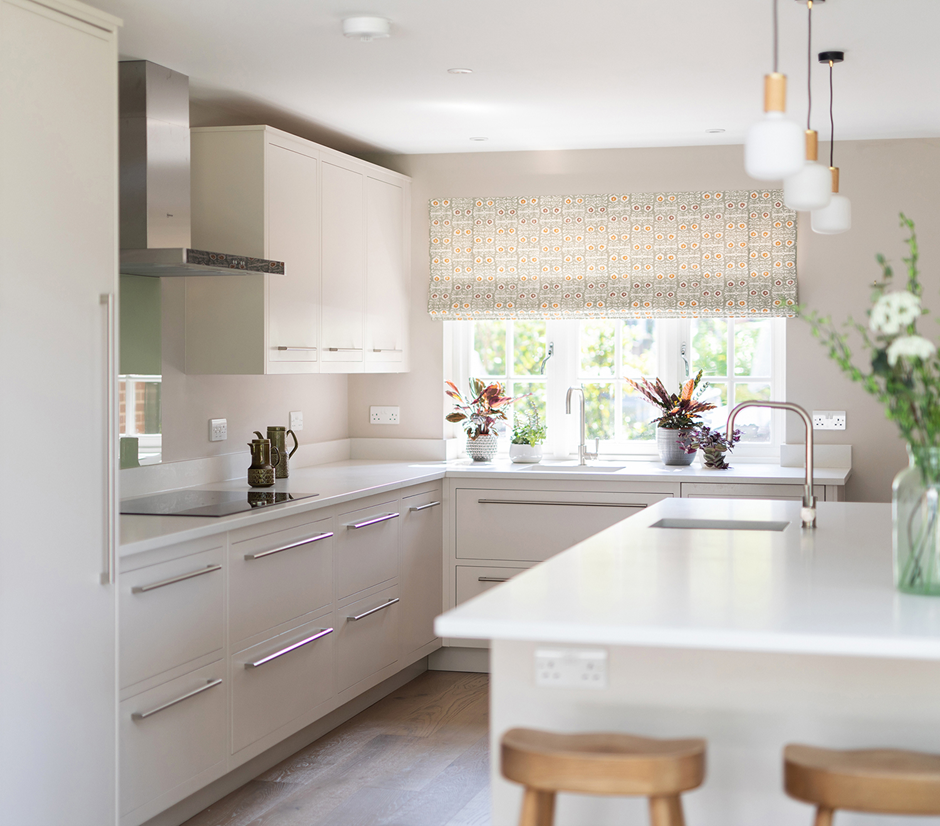
A fabulous fabric from Rapture and Wright introduces a touch of colour and pattern to this off-white kitchen painted in Farrow and Ball’s ‘Skimming Stone’.
1) Using off-white kitchen cabinets softens the clinical harshness an all-white kitchen can project.
The kitchen above was created as part of a new extension to a family home in Tunbridge Wells. It needed to incorporate an informal breakfast area and a seating area that would naturally lead out onto the garden. As such, the kitchen cabinets needed to blend into their open-plan surroundings but also have linking elements that would enable the whole space to act cohesively. Colour was key, and although at first glance you think it's a white kitchen, the cabinets are actually painted in Farrow and Ball's 'Skimming Stone'.
The walls are painted with 'Elephants Breath’ and I’ve chosen a wonderful curtain fabric from Rapture and Wright to introduce a touch of green to the scheme. This provides a visual link with the garden and ties the splashback, sofa, cushions, coffee pots and vases together.
The result is a room that has its own unique style and impression of space but has avoided any hint of clinical coldness.

2) Off white kitchen cabinets help to hide scuffs and stains.
The downside to that gorgeous clean appearance all-white kitchens have is that they are high maintenance. Every scuff, stain and spill can be detected. They aren't any messier or dirtier than any other kitchen. They just reveal every crumb.
If you choose a slightly darker colour, however, your kitchen immediately becomes far more forgiving. Your eye won't be instantly drawn to every dribble, and you won't feel like you need to spend every spare minute cleaning.
If you have chairs arranged around an island, you can also take a tip from another family kitchen I've created (shown above) and paint the bottom of your island a darker complimentary tone. It will help to hide those horrible shoe scuffs and provides you with the opportunity to introduce an accent colour.

Simple elegance has been achieved through a combination of a floral blind and kitchen cabinets painted with Little Greene’s ‘Dash of Soot’.
3) White is not the only colour that goes with everything.
Many people choose an all-white kitchen because it's a safe choice. Kitchen appliances are all available in white and units are easily matched with other fixtures and fittings.
It's not your only colour option, though.
Many other colours can be just as versatile; it's just a case of matching your colour tones. In the image above, the island is obviously a shade of blue (it's Little Greene's 'Livid'), but the much paler cabinets behind them are painted in Little Greene's 'Dash of Soot'. A shade that at first glance can seem white. The key is that both colours have underlying cool tones. These colours are further tied together by the pale grey porcelain floor tiles, the heavily veined marble splashback and the pale quartz worktop. The floral blind brings everything together, and the small splashes of pink and green make the design sing.
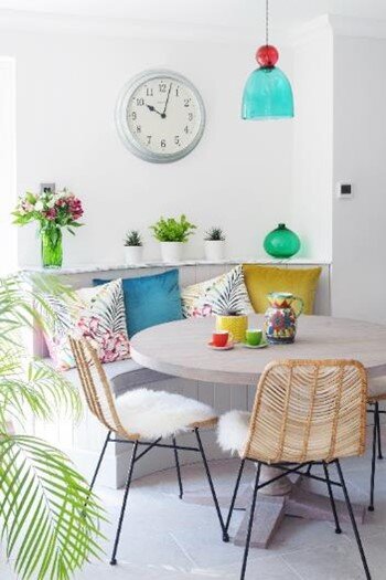
A welcoming built-in curved dining corner has been painted with Little Greene’s ‘Dash of Soot’ and accessorised with colourful cushions and accessories.
So, as you can see, just changing the shade of your kitchen cabinets slightly can make a huge difference to the feel and functionality of your room.
You can still have long-lasting effortless style, but you will also gain texture, movement, individuality and life.
Want to know how it will work in your home?
Then give me a call on 07773 372 158 or send me an email via nicky@nickypercival.co.uk
I look forward to hearing from you.
Nicky