
Colour Palette for 2024
Ubiquitous neutrality
The ubiquitous neutrality of grey has dominated the world of interior decoration for a few years now. But this is likely to change next year. It’s time to warm things up a little…
Soothing the soul
Chocolate brown, caramel and all things earthy warm and natural are the colours for next year. These cocooning, earthy palettes are a reaction to years of cooler interiors. In 2024, it’s going to be all about soothing the soul. Being calm and restful, but in a more colourful, enveloping way than is offered by the neutrality of grey.
I love the way Little Greene have paired the colours Light Bronze, Nether Red and Elysian Ground in the image below.

Image supplied by Little Greene
Sense of calm
Brown has a sense of calm and brings a connection with the outdoors. I recommend incorporating brown alongside a more neutral palette – you can create a focal point through colour-blocking, using neutrals to frame bolder and accent colours. Fallow and Ball’s London Clay is a good example of this. It has magenta undertones for sumptuous brown and is the perfect choice to offset dark mahogany furniture, which will also make a comeback next year.
Perfect backdrop
‘Ganache’, by Little Greene is also a gorgeous rich red brown that has plenty of drama and can be a perfect backdrop for some of the natural materials which are often to be found in contemporary interiors. These include wicker, rattan, warm woods, cork and bamboo.

Image supplied by Little Greene
Little Greene launched a lovely new collection at Decorex this year, called ‘Sweet Treats’. It perfectly encapsulates this palette of rich warm hues, of which ‘Ganache’ is one example.
Here is the full collection of nine colours:


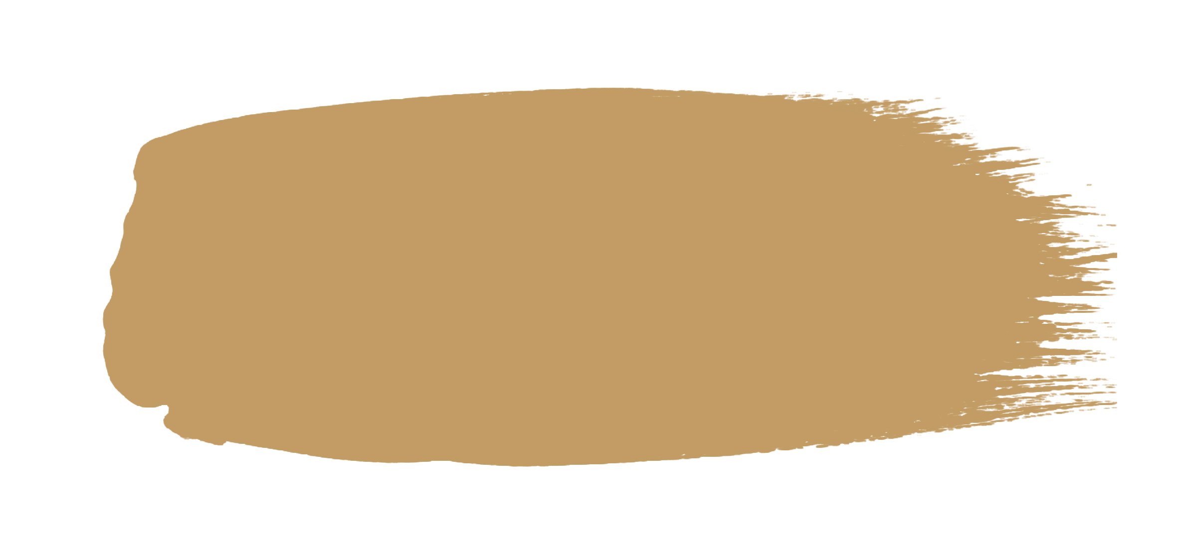
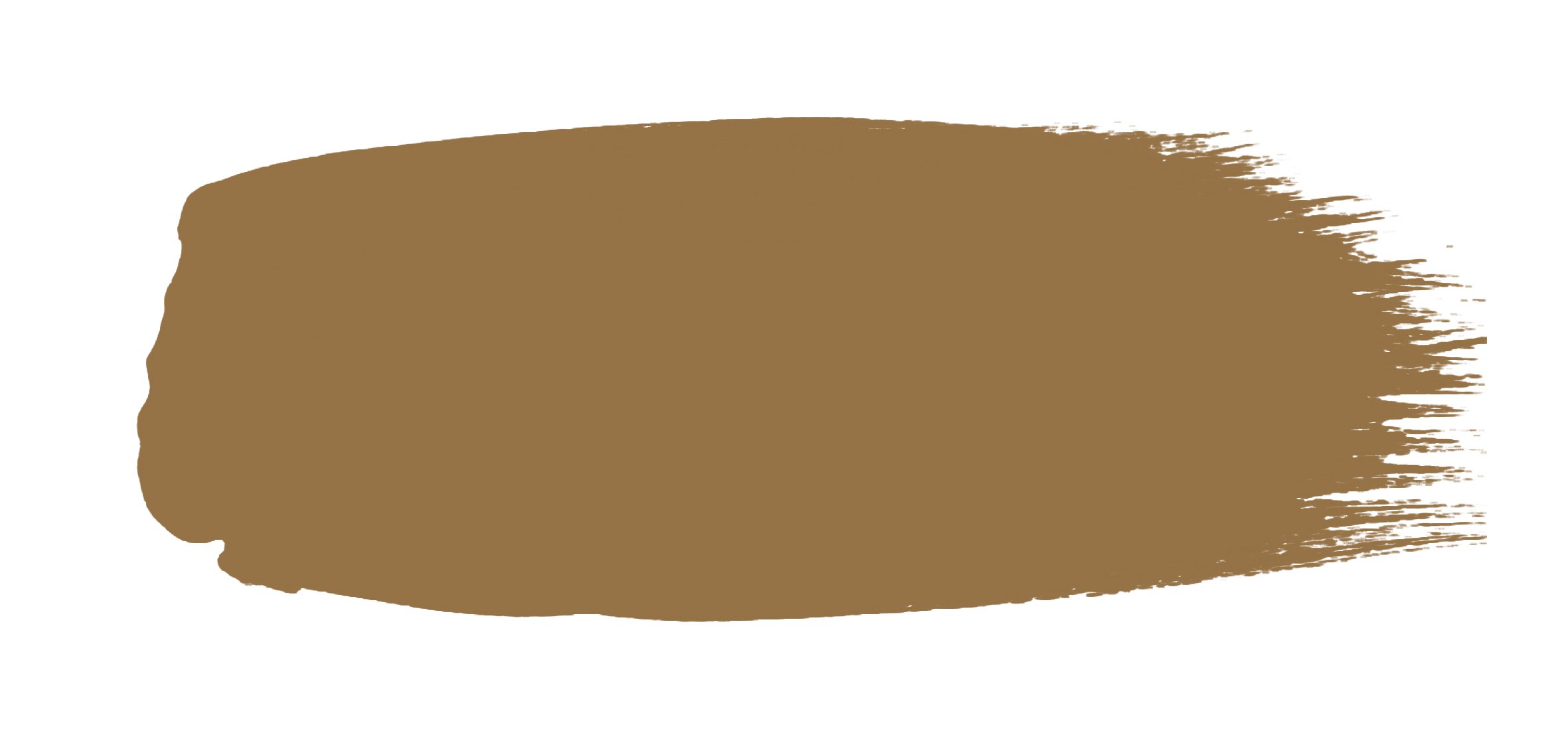
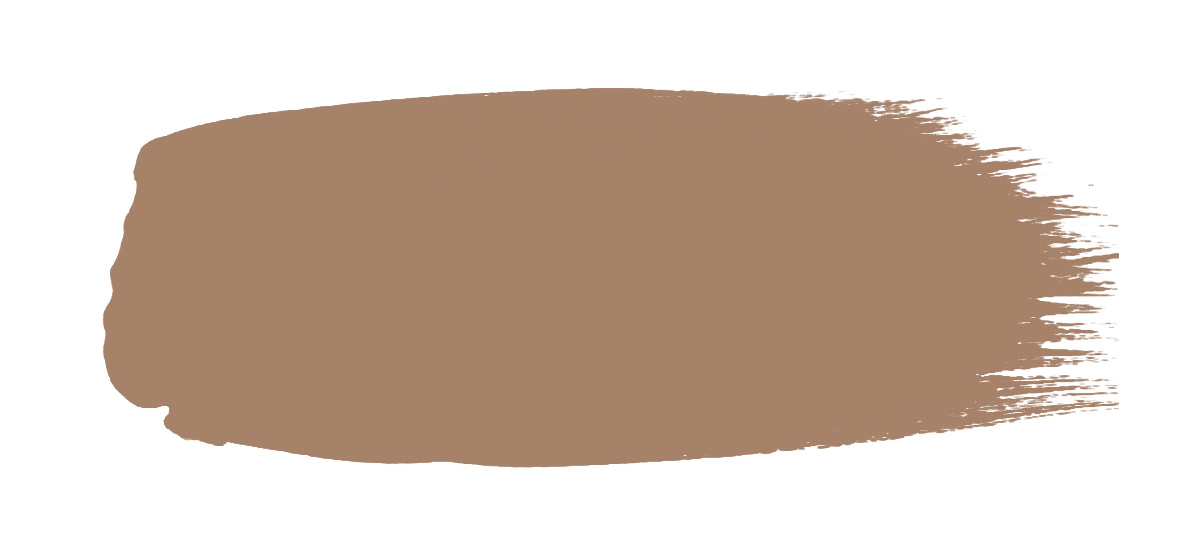
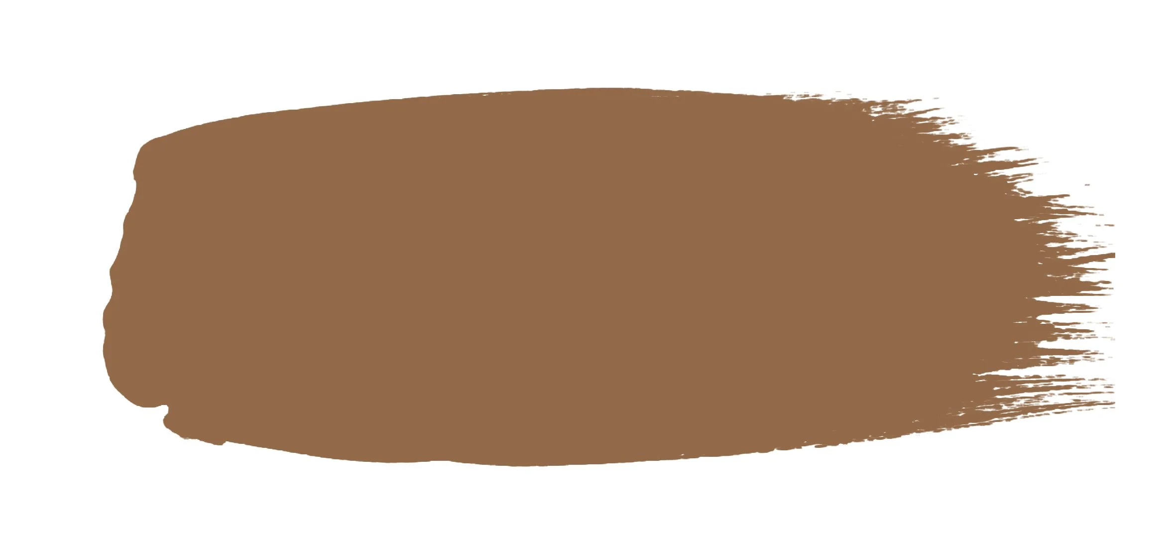


Image supplied by Little Greene
Variation and texture
Alongside these, you could also consider using ochre and russet hues for variation and texture. They are autumnal in feel and show a reaction to the changing of the seasons. They can work well with sumptuous velvet sofas in burnt orange and tobacco browns.
Enhancing cosiness
Paint and Paper 'Library ‘Caddie’ is a perfect accompaniment - this clay-like hue is natural and warm. It enhances cosiness and a sense of calm. It also pairs beautifully with the softness of ‘Desert Rose’ and almost black ‘Aqua Viva’.

Image supplied by Paint & Paper Library
Altelier Ellis epitomises this look with rich biscuit hues and deep charcoals, as seen here in its cosy mid-brown, ‘Tea and Toast’.

Photo Credit: Atelier Ellis
Antique brass and bronze hardware are perfect to add the finishing touches to this layered look as shown in this example at The Vices Hotel

Photo Credit: Corston and The Vices Hotel
Perfect choice
Green is still showing no signs of slowing in popularity, but my advice would be to use soft, earthy shades of olive and sage rather than pastel pistachios. Little Greene ‘Olive Colour’ is the perfect choice to offset other ochre yellows and deep blues.

Image supplied by Little Greene
Telling the story
Atelier Ellis is one of my favourite suppliers. The company’s philosophy says they make “quiet, beautiful, breathable, handmade paint to help people tell the story of their home”. I couldn’t agree more…
This deep cool, but full-bodied, green Firle is almost neutral in its calm countryside, South Downs hue.

Photo Credit: Atelier Ellis
Great versatility
Totara is another beautiful rich green, with great versatility for cabinetry, kitchens and, as seen here, hallways.

Photo Credit: Atelier Ellis
Sophisticated, timeless and classic
Mushrooms and taupe of all shades are sophisticated, timeless and classic, and a nod to the neutrals that Kelly Hoppen advocated so many years ago. Warm mushroom greys are simple, elegant and a good base for any interior to create a serene atmosphere and provide a great background for any additional palette.
Even darker hues are becoming popular – F&B ‘Off Black’ and ‘Cracked Pepper’ by Behr make for great statement colours. Many interior decorators are starting to recognise that anywhere you can use white, you can also use black, a colour which seems to be very popular for use with staircases just now as this example below.

Photo credit: Wholesale Carpets
Adding warmth
Soft off-whites with yellow, green or red undertones add warmth, work best in period properties, and are suggestive of the quality of light north of the Mediterranean. Good examples of these are the neutrals in F&B’s ‘Carte Blanche’ collection. ‘Au Lait’ and ‘Roasted Macadamia’ in particular.

The ‘Barbie’ factor
Soft pinks of all shades have been popular already this year. All things ‘Barbie’ have been hugely influential. For use in interiors, designers have been favouring peachy, warm hues like ‘Pink 13 Nashville House’, from Lick paints.

Photo Credit Lick
F&B have an inviting selection of pinks. ‘Calamine’ has a light touch of grey that prevents it from seeming too ‘sugary’, which also gives it a much fresher finish. Have a look also at ‘Sulking Room Pink’. This is my favourite (just for the name alone), and is a subtle, powdery rose, which blends fabulously with charcoals and olives.
Uplifting
Lavender is a fabulous, joyful, spring colour which can uplift you and influence how you feel. Everything in these trends is about affecting one’s mood, creating either fresh or calming interiors. Shades of purple have previously been associated with wealth and royalty, and while many might associate it with a more traditional interior scheme, designers are also incorporating it into fresh, contemporary aesthetics.

Photo Credit: Limelight Interiors Photography
Earthy, sophisticated palettes
In conclusion, I would say that these earthy, but sophisticated, palettes are here to stay. They speak to our souls, encourage that ‘hygge’ feeling we crave and keep us grounded, but uplifted. These are also colours that speak to me on a personal level and perfectly illustrate my style and approach to designing for people’s homes.
Whilst there are brighter pops of colour in the trend forecasts, especially for fashion, they are primarily likely to be used as accents against the softer, more natural, palettes that will be the mainstay this coming year.
I love providing interior design direction for family homes, considering colour, furnishings, flooring and lighting, along with family living, an element of indulgence, and a little bit of drama and plenty of personality.
If you would like a hand creating your dream home or want a second opinion, give me a call, 07773 372 158, or send me an email via nicky@nickypercival.co.uk
I look forward to hearing from you.
Nicky